
American Family Insurance Life Pages

The Problem: Updating under performing pages for usability, navigation and brand identity.
My Role: UX/UI Designer
Timeframe: 1 week
Tools: Adobe XD, Optimal Workshop

The Problem
Background
This redesign was a part of the Enterprise 1 initiative at American Family Insurance. A goal to integrate enterprise wide branding and styling to satellite companies websites. I was assigned to update the life insurance pages for the satellite company, Homesite.
This was my first experience working in Adobe XD as well as my first project at American Family. Looking back there is a lot I would change about these pages, given that I am still a student and learning new things everyday! However, I am still proud of how much I learned about design, UX, and life insurance during this project.

Original Home Page

Discovery Phase
I began my process by conducting usability research on the existing pages as well as competitive research. Here I was able to pinpoint areas of improvement:
-
Increase readability and scan-ability
-
Create navigation
-
Apply American Family brand standards
Original Policy Page
The Solution
Homepage
My goals for the homepage, or landing page, was to increase readability by,
-
Changing horizontal boxes to vertical
-
Rewrote long paragraphs in concise bullets
-
Add new section "Why Do I need Life Insurance?"
This started with changing the horizontal boxes to vertical boxes, which would allow the user to compare the 3 policy options without having to scroll up and down the page.
Secondly, I wanted to rewrite the long paragraphs that described each policy. Distilling them into simple bullets that clearly state the difference between the policies. User testing found that most users did not want to read the long paragraphs. I also added a section entitled "Why do I need life insurance?". After doing a user empathy exercise, I realized that many people are unaware of the benefits or purpose of life insurance.


Redesigned Home Page
Tile Sample
Policy Pages
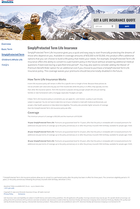
Redesign Policy Page
The goal of the policy pages was to add navigation, visual hierarchy and American Family branding.
-
Added a side navigation
-
Created a stacked layout
-
Add American Family branding and styling
A main issue for the policy pages was that there was no navigation. This meant that users had to use the back button to navigate to the homepage and select another policy from there. So, I added a side navigation bar so users could navigate to each page from anywhere.
I opted to scale back the hero banner. The original site's header would take up the entire screen, and we found during user testing that some users didn't understand that the page had more content and wouldn't scroll down. With the smaller hero, the user can see on that the page has more content.
I created a visual hierarchy by contrasting the headers. This helps the user's eye scan the page and find information faster.
Throughout the site, I worked to add American Family branding. As most users come from the main AmFam site, it is important to keep the consistency of the brand. This included new fonts, colors, logos, and copywriting.

Redesign Hero Banner
The Outcome
User Satisfaction
After the final version of the site was complete, I continued onto user testing to gauge the success of the redesign. I conducted an A/B Usability test, testing the new version of the site against the original. Users where given a list of 5 tasks to complete. 5 testers were given the original site while 5 others were given the redesigned site.
The test found that the users on the redesigned site where 72% more successful at completing their tasks. They were also able to complete the tasks more than twice as fast as the original site users. This had a lot to do with adding in the navigation so users didn't have to use the back button, and adding the headers and sectioning to the policy pages.
72%
2x

Increase in user task success
Faster task completion
Increased user satisfaction
Lessons Learned
Of all the projects I have done in my career thus far, I grew the most during this one. This was my first experience with Adobe XD as well as my first professional UX job. I learned how to design using a cooperate style guide, using correct fonts, colors and spacing guidelines. I was able to conduct user testing and use that data to influence my design decisions. I learned how to select proper images for the site and place them in meaningful ways. I also had the opportunity to practice my technical writing skills when editing content.
When I was halfway through the project I looked at my pages and I was disappointed, so I took them to my manager. I told him that they looked boring, to which he responded, "Lexi, it's life insurance, it's supposed to be boring". In school, the most creative, fun designs are the ones that are praised by the professors. But in real life, it's about making the design usable and communicating the information to the user. I realized that even though my designs weren't flashy or intricate, they succeed in communicating the information and making the experience usable.